
Cone
World
Industry: Icecream
Brand Tone: Retro, Exuberant, amusing, artificial (in a nostalgic way)
About the Project:
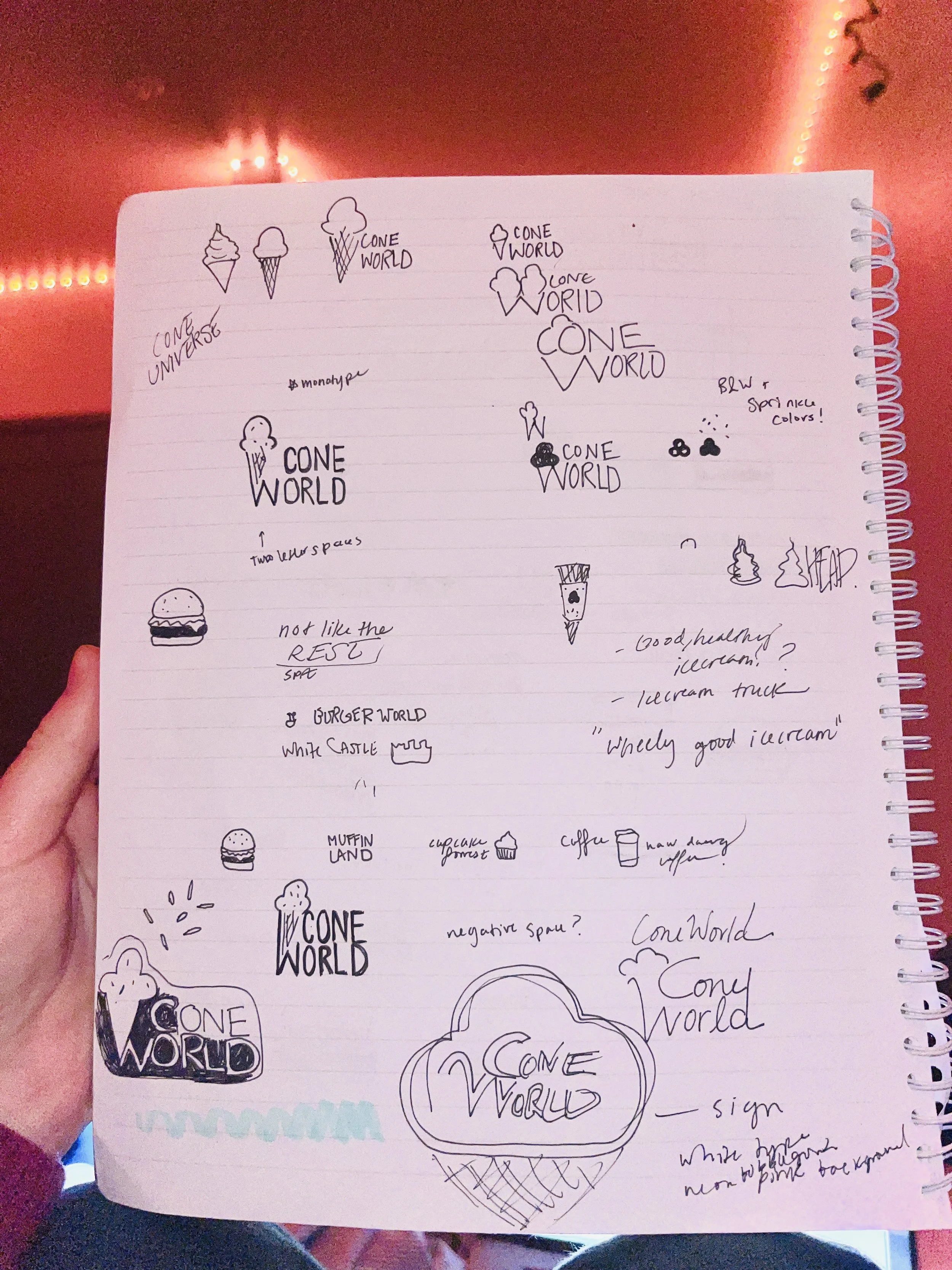
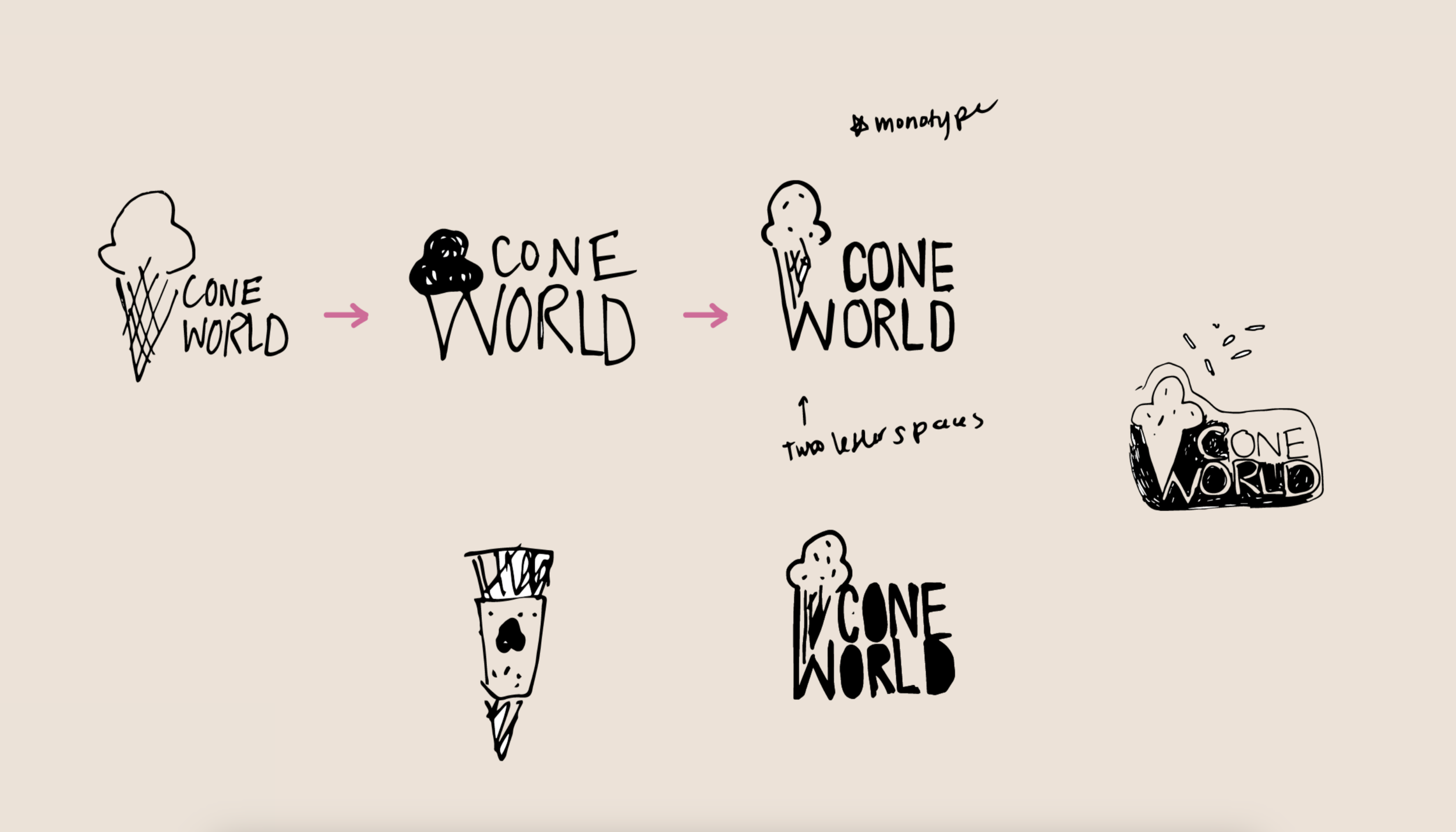
This branding is the result of a brief, self-prescribed exercise to create an identity system for an ice cream company. The name “Cone World” came to me in the shower probably and then bam, I took a trip to Sketch-ville, my notebook. Some more background on this: after taking a course in design history, I was inspired by the case of Paula Scher’s unexpected ShakeShack branding, and also Herb Lubalin’s “typogram” logos. Ultimately, this project is an exploration of expressive typography.

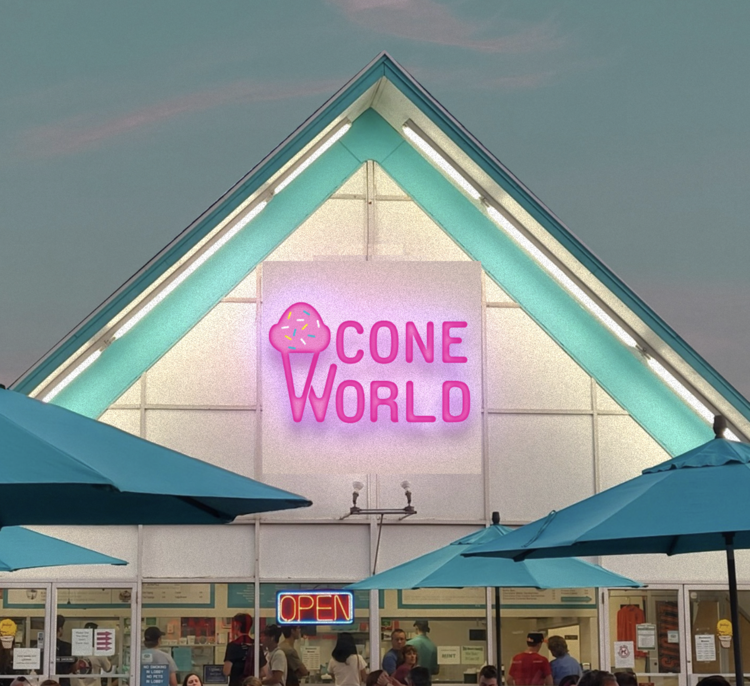
This mockup features beloved Champaign, IL ice cream shack Jarling’s Custard Cup. It exemplifies the not-so-vanilla retro-inspired architecture that I imagine for Cone World.. none of that grey cube modern minimalist corporate devoid of a soul architecture for this ice cream shack.

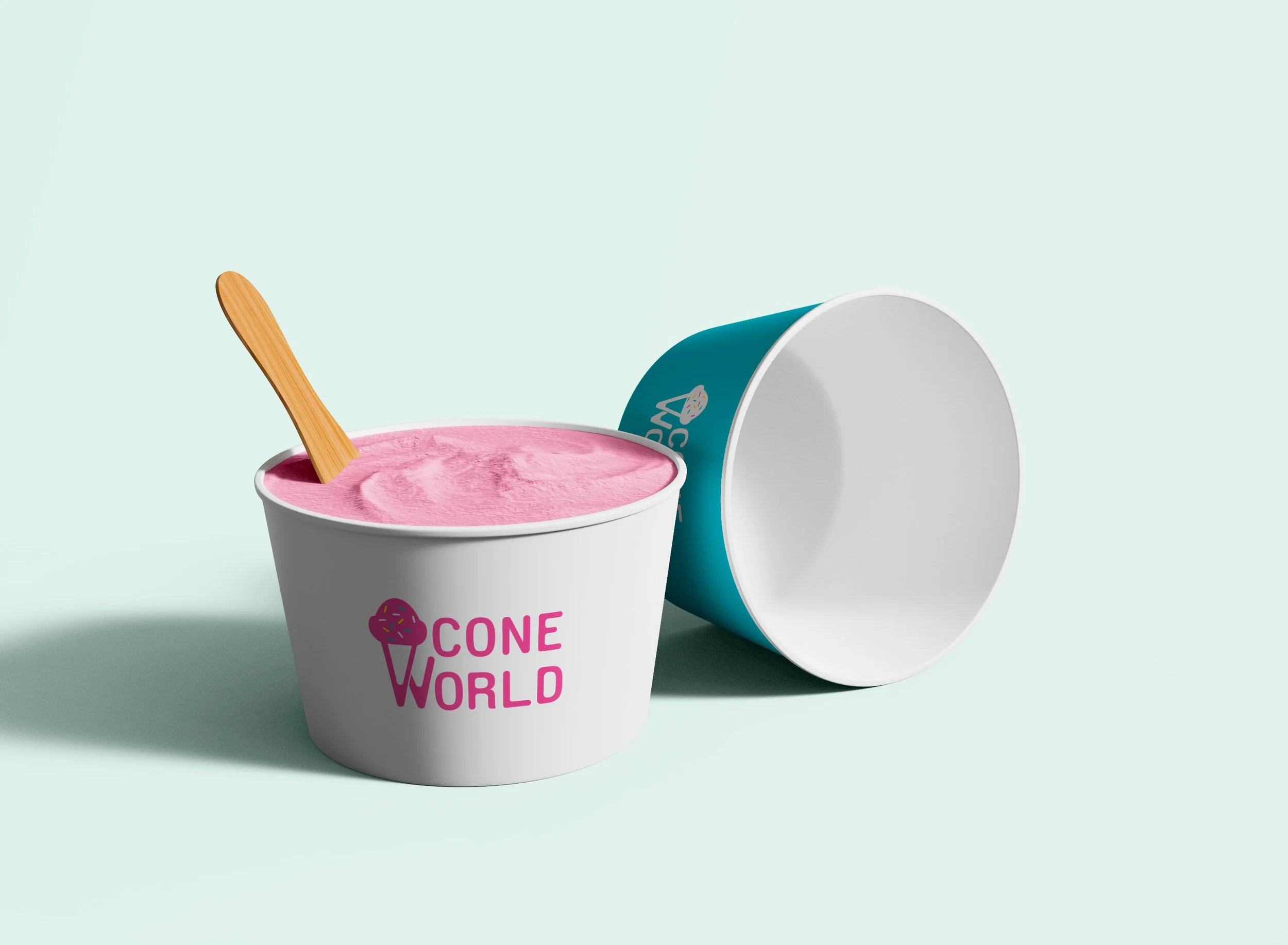

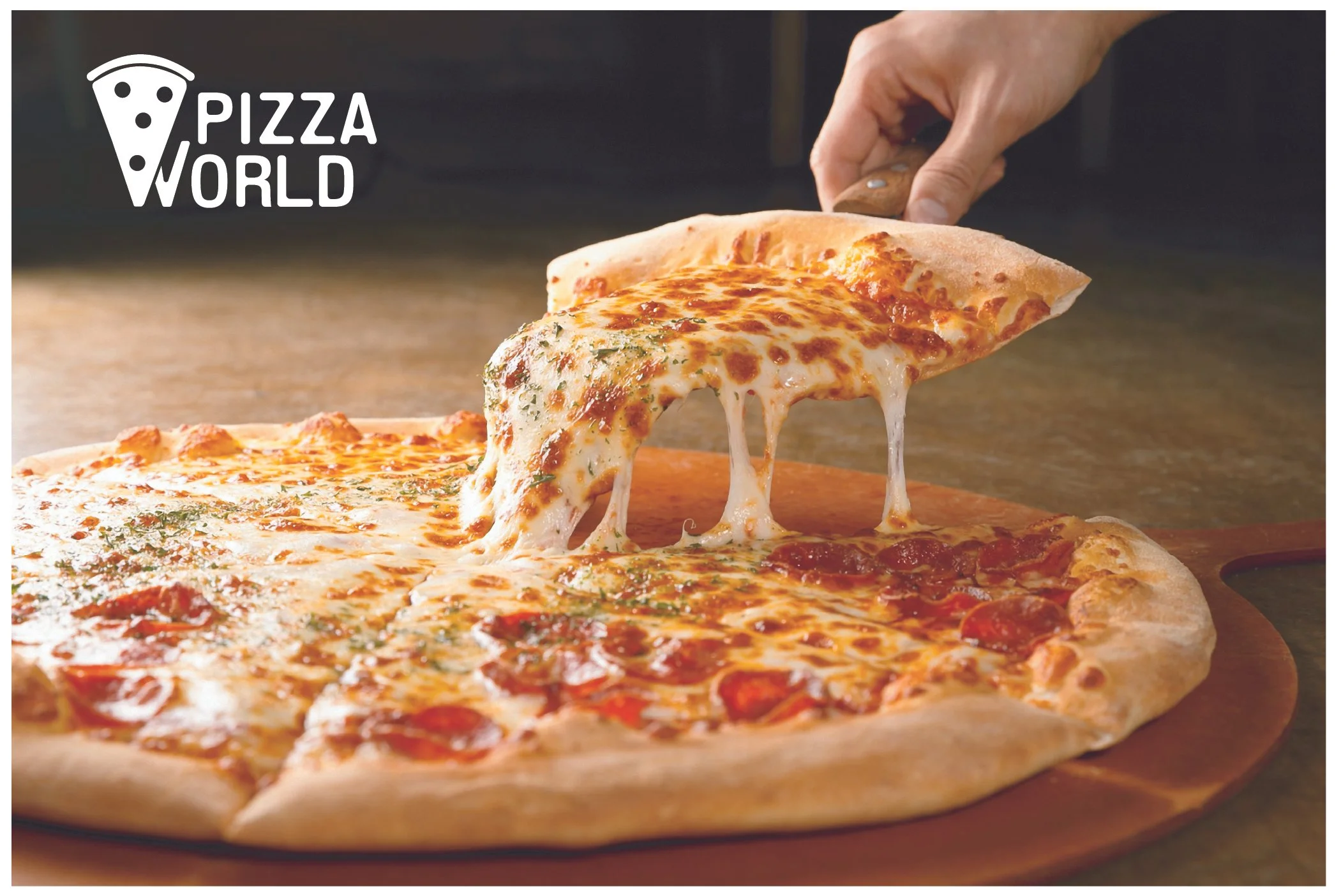
If Cone World had a savory sister, it would be Pizza World. Together, they fall under the corporate umbrella of Chill Slice INC. Urban Outfitters would undoubtedly foam at the mouth to sell these puppies on officially licensed merchandise in their graphic tee section. The vibe is giving cool as cucumber, hot as an Ambercrombie model.


May 2024